
I've created an exhibition poster promoting a Jasper Johns event.
First I had to research who Jasper Johns was and what his contributions were to the art world. I created a project folder on my computer and added a file called research and put all my research notes into this folder. I learned about where he was born that enabled me to establish a method by which to entice the potential attendees to the event. My creative process involved trying to access the way in which he expressed his work, developing an understanding through the data sources available to me: encyclopedia, Wikipedia, internet, self reflective interviews of the artist discussing the present body of his work his own work at that time, as well as critical reviews from professionals within the art industry that specialized in his particular genre. Abstract expressionism.
Then, I created an inspiration file in my project folder where I placed images of Johns, his artwork, Georgia and South Carolina.
Once I had a good sense as to who Johns was I was ready to begin creating a poster in Adobe Illustrator. Going through the steps outlined in the class I proceeded layer by layer. The first was Johns' name and creating the right font. I wanted a font that had a woody texture that suggested the South where he grew up, but also convey the abstract nature of his collaborations that influenced his work.
I had multiple renditions of the poster, never quite satisfied with how it represented Johns. I kept playing with the fonts, size, and leading until I reached something I thought would work. I wanted to include some sort of flag image since he was well known for this. I also wanted to include the pop art primary colors which he often used in his artwork. I kept reworking the piece and getting input from classmates and the professor, on Slack and in class, to continue to improve the poster. I got so down and dirty that I ruined a pair of jeans trying to get texture into my piece (this didn't work out though because I didn't use it in my final poster).
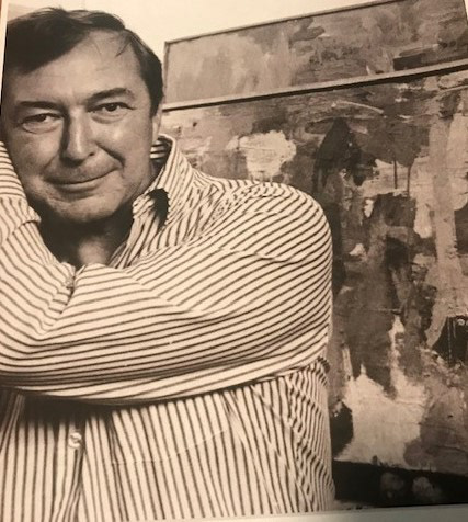
Some of Johns famous art pieces, his photographs, pics of Georgia and South Carolina from my inspiration file:


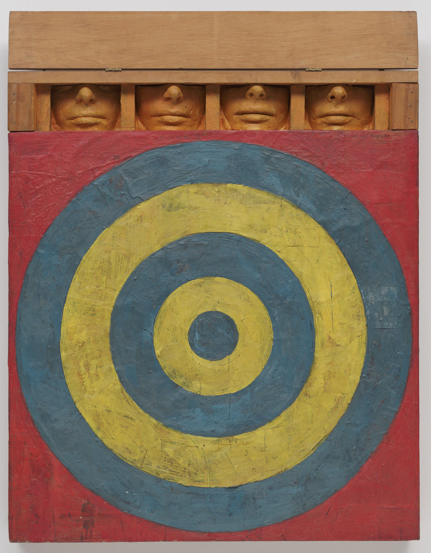


Johns photos:


Georgia:


South Carolina:


Links to interview and reviews of Johns work by professionals:
https://www.youtube.com/watch?v=yB8nhqz2nQ8
https://www.youtube.com/watch?v=gziGYLsu1go
https://www.youtube.com/watch?v=64lFODK9MWE
https://whitney.org/exhibitions/jasper-johns
research and Notes:


My notes:


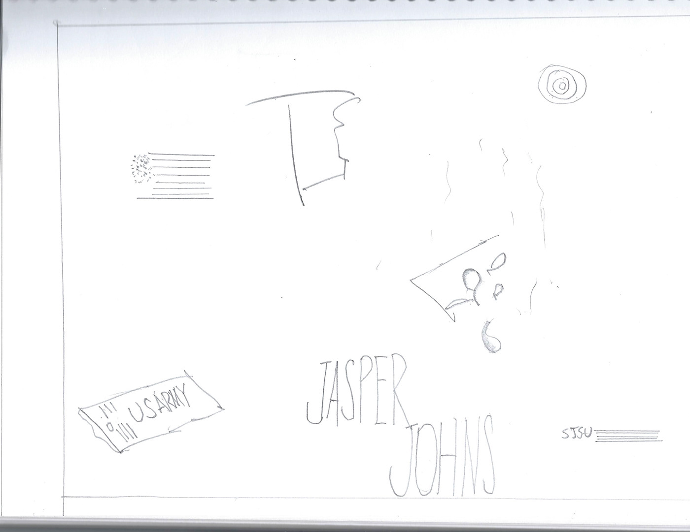
6 rough sketches:


Draft Poster designs:
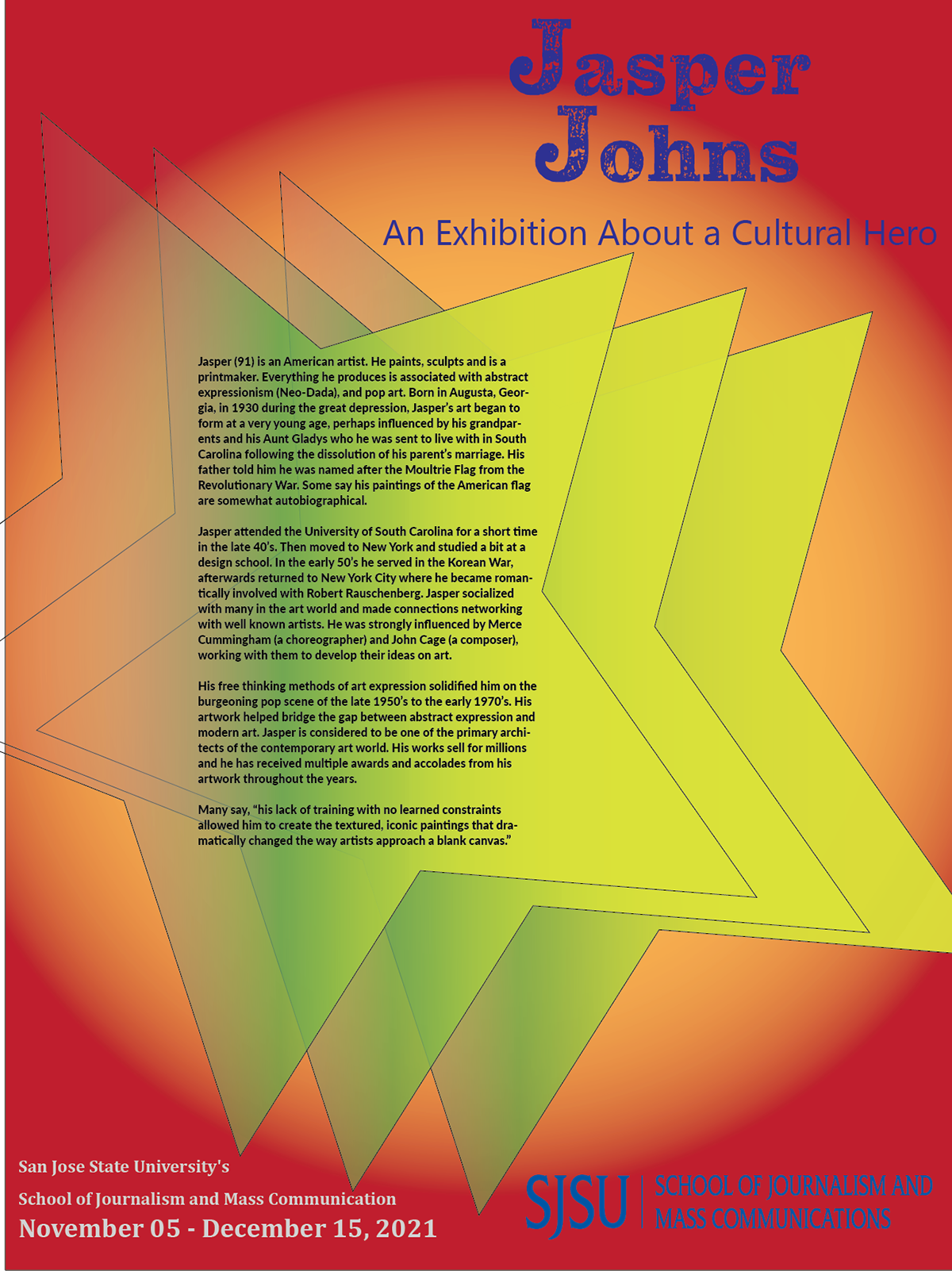

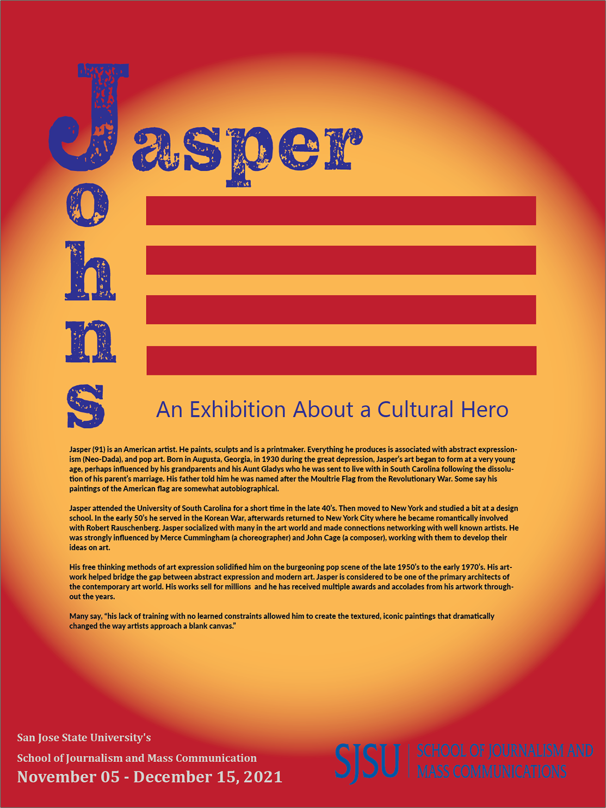


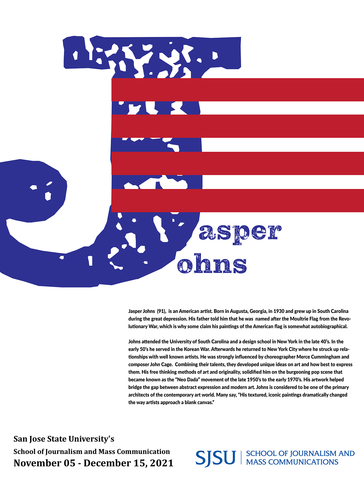
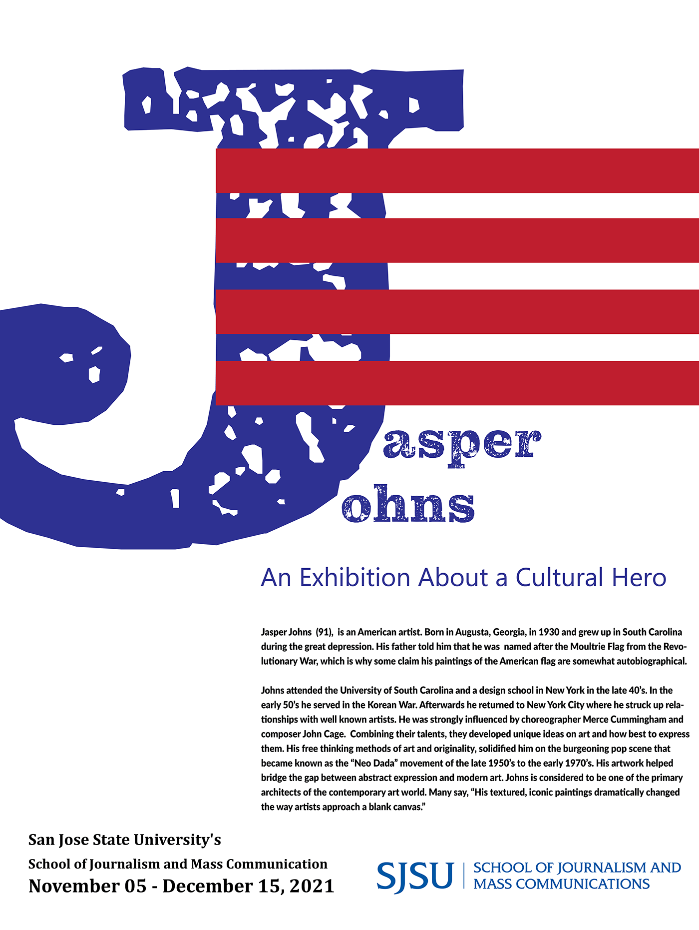
Final Poster:
The finished piece is meant to entice people to attend, through the attachment of patriotic symbolism that he was known for, and upon attending and viewing his work they would see there were multiple artistic layers to this artist.:
Self-Assessment:
The most challenging part of creating my poster was choosing a singular piece to represent someone that doesn't necessarily want to be pigeon holed within an archetype. Just when you think you know where he's coming from, he changes lanes. His artwork is topsy turvy, not what you were expecting at all. Those who attend the Jasper Johns exhibition, will undergo a change in their internal reality. To describe the exhibit afterwards can be likened to describing the taste of water. Hence, is the nature of abstract expressionism. You can't explain it, but it will quench your thirst. I believe what Johns' hope is that people will come away from the exhibit with a sense of well being and an appreciation of his craft. For most Americans, the flag is the most positive image which is why I chose the red, white and blue colors and the flag-like stripes next to his name. All this was meant to coincide with the event.
If I could improve the poster, I would incorporate physical objects like that would create an additional dimension within the poster.
Advice to someone who wants to create something similar, would be to use the technology to the fullest, and understand how to make it work so that it best represents your ideas.
If I could learn a new skill, or tool instantly, it would be to learn how to merge photographic images into the body of my project. The usefulness of this skill is that it would enable direct application of a concept as it came to mind. It would limit the loss of an idea due to the lack of knowledge of technology in order to apply the idea.
Anyone that would like to do something similar, I suggest that you stick to your original idea and continue to refine it. As anxiety starts to ramp up the stress level, you need to know when to stop modifying the poster. I'll quote an art instructor I had who once said: "The difference between a professional and an amateur is that a professional knows when to stop."


